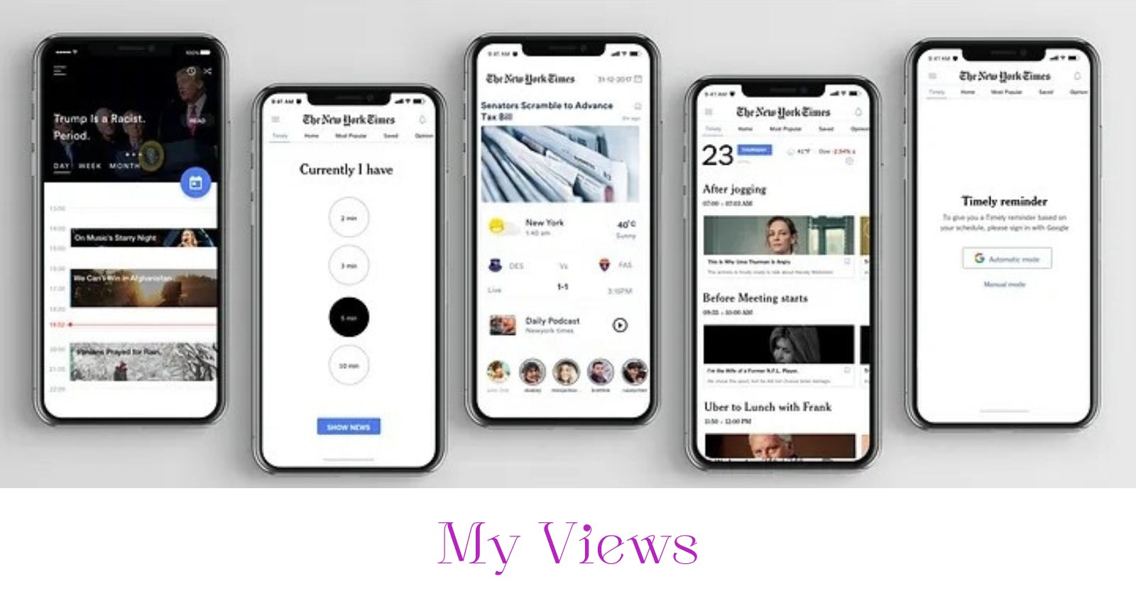
My views on "Redesigning the New York Times app — a UX case study" by Johnny Vino
This UX case study really opened my mind and gave me a clearer understanding of how case studies should be conducted and represented.
The case study is conducted to improve the user experience on the news app, by catering to the realities of most users. This reality is something we already know, but knowing is totally different from making use of the information to improve user experience. The reality being that most users might not want to use the app due to the irrelevant content that are not part of their interested industries, amongst other reasons.
Following their design process, I learnt that you shouldn't stick to just one concept or the first concept when coming up with possible solutions. Let your mind and ideas roam free, list them out and then select the best idea that solves the problem effectively. Also, testing out your ideas can give you a better understanding of the feasibility rate and allow you to select the best idea.
Looking at the structure of the case study, I learnt that what some designers see as redundant work or the irrelevant background work is actually necessary in showing evidence of growth and your design process. I noticed that they included pictures of their rough sketches, wireframes and ideation process to give the viewer a better understanding of the journey to arriving at the solution. Not just slapping a finished design and talking about their process, they actually walked me through.
I noticed how they included their ideating process and I particularly liked how they showed us the feedback they got based on data and how they were able to make the necessary adjustments to improve the prototype.
This was a walkthrough case study, I genuinely enjoyed the process as a fellow designer and I learnt a lot from reading it.
Don't forget to check out this amazing case study!
